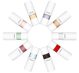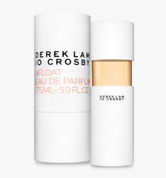
American designer Derek Lam recently released a new collection of ten fragrances, a partnership with Butterfly Beauty (the producer and distributor of the Elizabeth and James line) and his brand's first official foray into the perfume world. 10 Crosby Street is Lam's Manhattan business address, and it inspired the name of his more affordable diffusion collection, which offers modern fashion with a "calculated simplicity and thoughtful detailing" for a younger "downtown" woman. Now the address is also being applied to these fragrances: "1 STREET, 10 STORIES, 10 CROSBY."
The 10 Crosby packaging has a fresh new look, with minimalist white cylinders and a rainbow of glass shades. The fragrances inside, however, are very much status quo. In their style and tone, they remind me of the wildly successful Marc Jacobs fragrance collection as well as some other diffusion lines. Of the five I've tried so far, all are linear and lightweight, and they're definitely aimed at the 18-30 demographic.
Each scent is accompanied by a short film, and you could even watch the films while sniffing the matching perfumes, as I've been doing this week. My thoughts?
Silent St.
THE COLOR: Cloudy white
THE FILM: An aging doorman at an upscale hotel goes rogue and indulges his fantasies of living in luxury.
THE SCENT: White musks, pure and simple. If you have fond memories of The Body Shop White Musk or Love's Baby Soft, you may love this designer milkweed-puff of a fragrance. Soap and talcum powder, very sheer and quite long-lasting.
Looking Glass
THE COLOR: Light amber
THE FILM: A woman left alone after a break-up gazes into the mirror and then dances wildly to the strains of "I'm Nobody's Baby Now." Hey, at least she got to keep the SoHo loft.
THE SCENT: Magnolia and tonka bean. It's an inoffensive day-to-night "fleurmand" with warm vanillic notes under creamy florals. I wish it smelled more like the magic-realism conclusion of the film (roses and vines, settling dust).
Hi-Fi
THE COLOR: Lavender
THE FILM: A beautiful young woman finally looks up from her smartphone and has a life-changing revelation about her unsuccessful history of online dating. If only it were that easy, right?
THE SCENT: Peony and narcissus, with some uncredited pink roses underneath. This fragrance would fit right into a scent wardrobe that includes See by Chloé and her (sorority) sisters. Considering the message of the film and its song, it's an oddly conventional scent. Predictably, synthetically pretty. Almost more of a functional fragrance.
Drunk on Youth
THE COLOR: Pink
THE FILM: My favorite of the batch, because I'm a cranky middle-aged New Yorker who misses the "old" SoHo. A Crosby Street native remembers his parents' forbidden romance and his own childhood in the neighborhood.
THE SCENT: Apple and honeysuckle, very fresh and sweet. Maybe some kiwi, too? Emphasis on the "youth," in any case. A cousin to the DKNY Be Delicious family. I should probably give up with the film connections...
Afloat
THE COLOR: Orangey-yellow
THE FILM: An old-school hip-hop soundtrack ("Devotion" by Charizma & Peanut Butter Wolf) and two remarkably flexible male dancers throwing shapes in subway stations, on a beach, on a football field — and on Crosby Street, of course.
THE SCENT: Reportedly white mimosa and orris, but to me it smells like a citrus-musk shampoo. Maybe the two guys are going to shower when they're done dancing? It's the most unisex of these five, and the shortest-lived on my skin.

I'm going to try the other five fragrances (and view their films) soon. I think some of them may be a bit darker or richer — in any case, check back next week if you're curious.
The Derek Lam 10 Crosby collection is available as a preview set of 10 x 1/4 oz Eau de Parfum for $95, as well as individual 50 ($95) and 175 ($175) ml bottles at Sephora and the Derek Lam website.
I saw a display of these at Sephora yesterday and was horrified by the packaging. I’m all for minimalism, I love white, and am a big fan of tinted perfume, but the bottles are awful. The 5.9 oz is about the size of a quart of milk (wth) and they look like props from a sci-fi B movie or an episode of Star Trek: The Next Generation. I.e., not kitschy or retro fun, or clean and modern – just awkward, unnecessarily heavy, and silly. They reminded me of the canisters used in pneumatic tubes as imagined by Sci Fi writers… a century ago.
I was not tempted to smell any of them.
Online the packaging comes off very Pantone-y. If that makes sense?
The Pantone analogy makes total sense to me!
(Should also add, I haven’t seen the actual bottles in person yet — only the set of 10 ml sprays.)
I’d love to see a collection inspired by sci-fi B-movies, come to think of it!! — like the Imaginary Authors line, but different.
What a shame that the packaging sounds more exciting than the fragrances. 10 perfumes at once rarely seems to end well.
Sooo many. I get the connection with the address…but it’s like no one has heard of the “rule of three,” or else everyone just chooses to ignore it.
Filed under “Useful reviews of useless perfumes”. :^)
Hah. I feel like I’ve done my part, at least, then. 🙂
“THE SCENT: Peony and narcissus” …which I first read as peony and narcissist”
Freudian slip, yes?
Yes! I like it. 🙂
I tested a few of these the other day. 2am Kiss caught my attention. I plan on going back for a sample. I don’t care for the packaging, I think it looks cheap in person.
A few of the others seemed more interesting to me when I just inhaled from the samples, but we’ll see how they do on my skin!
I saw these at Sephora this past weekend. The display was white on white with a circular cutout for each fragrance. Since they were unboxed, the only way to know which fragrance you’re smelling is via the name on front panel of the shelf OR a tiny sticker on the bottom of the bottle that I could barely make out (heh, I gave up because I did not have my reading glasses and even if I had them, the labels were transparent with black text so how was one supposed to read it if the juice was darkish?). What if a naughty person decided to switch things around?
Aaaaaanyway, I shudder to think that had the address been 20 Crosby, would there be 20 (!!!!!!) perfumes at a pop. Eeeeek, save me!!!!!
I had the same problem. The color of the line around the bottle corresponds with the color of the lettering on the box, so that helps a bit, but overall it took too much of my energy to try them.
Okay, now I really need to swing by Sephora. Last time I went, they didn’t have these in stock yet. I did notice on the 10 ml atomizers, however, that the type is quite small and impossible to read on the black fragrance (and not so easy on the red one, either).
This is another packaging pet peeve and happens a lot with lipstick. If I have to break out my reading glasses to figure out which shade I’m holding, I ain’t buyin’ it. Clearly no one over 40 is working in cosmetics packaging departments, and I don’t appreciate yet another reminder that I am OLD.
Oops – this was meant to go with hajusuuri’s post.
This drives me crazy, too. I hate having to pull out my glasses to remind myself of the name/number of a lipstick I already own, or to check the ingredients on a skincare product in a store. I mean, especially if it’s an anti-aging product, surely it should *not* have teeny weeny type that *no one* can read without a magnifying glass?!