About the author: Nina is our guest shopper for London. She's on the road this weekend, so will be slow to respond to comments.
Once upon a time, print ads for Christian Dior perfumes consisted of beautiful illustrations, rather than photos of Jude Law.
If you love those illustrations, then you’re a fan of René Gruau, who drew them all.
Somerset House in London is currently hosting an exhibition of most of Gruau’s original artwork for the House of Dior, including several drawings that were never used. It’s a joyful insight into the shared vision of Gruau and Christian Dior, who were close friends as well as colleagues.
Dior and Gruau (it’s pronounced Grooh-oh) were both illustrators when they met on the fashion desk of Le Figaro in 1936. They seem to have taken to each other at once, coming from similar bourgeois backgrounds, with the same wistful attraction to the memory of Belle Epoque elegance.
When Dior launched his New Look in early 1947, he asked Gruau to illustrate his designs. Launching Miss Dior, his first perfume, later that same year, Dior called on Gruau again. “Do exactly what you want,” he said. “We speak the same language.”
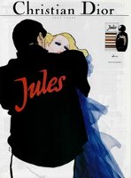
It became one of the most fruitful relationships in the history of illustration. In fact, so successful was Gruau’s work for Dior, he continued to illustrate for Christian Dior Perfumes for over twenty years after Dior’s death in 1957. His last work was the 1984 campaign for Jules, for which the company had originally commissioned photographers; inspired by the challenge, Gruau produced a series of illustrations anyway, and the company were so impressed, they used his work rather than the commissioned photos.
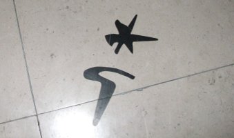
The exhibition is rather cutely flagged throughout Somerset House by having Gruau’s signature (a star with a ‘G’ underneath) printed on the floors (see above). The illustrations themselves are housed in a gallery reached by an opaque glass spiral staircase, which was a challenge in itself to someone not high in depth-awareness like me. (It was hard to tell the difference between a step and a tile join, so that I probably looked liked someone feeling their way along a plank bridge in an Indiana Jones movie.)
No photographs were allowed, alas, so you’ll have to rely on my words to get a feel for the exhibition. The gallery is windowless, wooden-floored, the drawings are mounted on gauze cages coloured red, peach and flesh-pink. On one side it’s all illustrations; on the other, there are museum-type windows behind which are about ten Dior dresses, some by Christian Dior himself, and some by the current Dior designer, John Galliano. There is also a small display of perfume bottles, all of which were drool-inducing.
There’s a glass cabinet full of Christmas cards, commissioned by Dior every year from Gruau. Apparently these are being exhibited for the first time. They’re gorgeous. To make them, fabric was compressed between two sheets of embossed paper, a process which was often used for the packaging of the perfumes. As I viewed them, people kept murmuring ‘I wish I’d been sent one of those cards…’ as they drifted past. I wonder if they ever turn up on eBay?
The illustrations (I counted seventy) are done in ink, gouache and pencil — some mention watercolour. They’re fairly small — about the same size as the magazine pages in which they would eventually feature. Those magazine ads show pretty much what Gruau painted; there’s no sense that anything had to be airbrushed or photoshopped. (Although one story that amused me is that the original 1956 artwork for Diorissimo showed the lady in the nude. Dior, although impressed by Gruau’s boldness, eventually asked the artist to clothe her in a black sheath dress. I wonder what he would have thought of Charlize Theron stripping off for J’Adore, years later?)
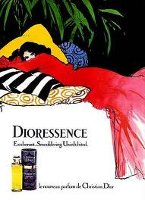
The exhibition covers the classic perfumes released between 1947 and the late seventies — Miss Dior, Diorissimo, Dioressence, Diorling, Dior-Dior, Diorama, Diorella, Eau Sauvage and Jules. I was surprised to learn that Dioressence started off as a line of bath products, with the perfume coming later.
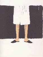
The overwhelming impression you get from the exhibition is elegance, humour…and legs. It seems that Gruau was fascinated by women’s legs since boyhood. “When I was five, I drew a pair of legs which provoked an outcry in the family.” The outcry was probably that the legs were impossibly long and shapely, because stunning legs are a feature of many of the drawings, particularly those advertising lingerie. (Apparently ‘gaines’ (girdles) and ‘gorges’ (bras) were an integral part of the Dior profile. I wonder if they were any more comfortable than Spanx?)
There’s also something lighthearted and playful about Gruau’s work, especially the drawings for male perfumes. The famous 1966 illustration for Eau Sauvage, showing two hairy legs under a bathrobe, make you grin. In the 1972 illustration, the lip stains on the man’s face were created by one of Gruau’s friends, asked to kiss the cheeks of the painting. (Annoyingly, we’re not told which lipstick it is.) The male face in the 1975 version looks amusingly like Rod Stewart.
If you’re into dresses, you’ll enjoy the selection of couture classics on display. Personally, I loved the original creations from Christian Dior himself,.and was less impressed by those designed by John Galliano. (The Galliano creations include a white boat-neck dress with carmine ruching at the waist, which I believe would make the wearer look as if she’d been shot in the stomach. And a red satin sleeping bag dress, topped with a hat made of layered black doormats. I can’t think why they don’t invite me to the Paris catwalk shows.)
I was intrigued by the pervasive smell of linseed oil and something like putty as I walked around. The Courtald Institute is next door, and I wondered if Art had penetrated the very fabric of the building. Eventually, though, I realised that the smell was coming from my programme. Which is excellent, as it allows me to re-experience the exhibition in the comfort of my own study!
There was one small detail that intrigued me. Throughout the exhibition, the printed explanations were in a font that had a strange feature on ‘st’ and ‘ct’ combinations. I’ve reproduced it here. Quite apart from my surprise at how many words contain ‘st’ and ‘ct’, I wondered if this was a special feature of René Gruau’s own graphic writing, or a font that I haven’t encountered before? Does anyone know?
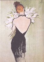
This is one of those exhibitions where you really, really, really would like to be a cat-burglar, and make off with an exhibit or two while the sirens wailed. After judicious study (the security man became deeply suspicious) I decided that I’d slip the 1963 Baccarat crystal bottle of Diorling (‘The amphora sits in a bronze scabbard dressed in gold leaf and topped with a stopper in the form of a rosebud.’) into a pocket, then snatch the aforementioned 1956 painting for Miss Dior, where the texture of the flowers dapples the paper and the woman’s back is smooth as milk.
The exhibition runs until January 9th 2011.
Hi Nina. I’m not the biggest fashionista or fan of fashion illustration, but I do love exhibits of drawings, sketches, and so forth. Sometimes the most simple line drawing can be the most elegant thing in the world — I feel like drawings are underrated treasures when most art audiences go for the bigger bombast of paintings and the like.
That typographic oddity you noticed is known as a ‘ligature’ and some modern typefaces have incorporated it sort of as a whimsical feature (though the ligature has a long history). See here: http://en.wikipedia.org/wiki/Typographic_ligature#Stylistic_ligatures
Thanks for the review. Wouldn’t it be great if some modern perfume advertising were as stylish as these Dior ads!?
Joe, thanks for the information about ligatures. How fascinating! Yes, I would love to see this playful elegance in modern perfume ads, especially at this time of year when we’re being bombarded by perfume advertising.
Ohhhh, I love the ads pictured. I have the Dioressence in a vintage magazine (I think it’s a Vogue US ’84). You got to see a whole exihibit of them! Was there a book published and sold for this or is it too small for such a thing? Perfume ads in magazines of the 70s and 80s (maybe early 90s) were a lot of fun but I missed the elegance of the ink, charcoal, pastel and watercolor ads of the 30s through the 50s (Coty, Guerlain, Dior, etc.).
Not sure if you’re familiar with Ruben Toledo’s whimsical, attenuated style and the creations he did for Nordstrom campaigns and Nina Garcia’s books. He brings back that (old) old-school vibe while still remaining very contemporary.
LaM, there was a programme / catalogue that came with the ticket, but I don’t think that they sell them separately. In the entrance hall, they were selling a few things, including some books on commercial illustration, but none of them were specific to perfume or Gruau. Thanks for the pointer to Ruben Toledo – you encouraged me to go look him up, and his illustrations are intriguing. I see he’s featured in the Victoria & Albert museum, so I must plan a trip!
Oh a wonderful essay on what must be a stunning exhibition! Thank you! I can just imagine the cat burglar and the flacons! And while I adore the stunning Charlize I have to agree that these illustrations are so much more elegant and sexily evocative in a subtle way. I am old enough to remember seeing many of them in magazines years ago; in fact these and others influenced me at Art school.
Winifrieda, I did find these works very sexy, and also intelligent in a way that often seems to elude modern marketers. I personally find illustration more evocative than photos/videos of real people, especially if it’s a known, celebrity face.
Is there a catalogue available for sale, or a book?
Love the review 🙂 And I can totally relate with the cat burglar sensation 😉
Sadly, no catalogue, although I’m sure they would have sold plenty if they’d got their act together. Somerset House has come fairly recently to public displays (it used to be the nation’s store of birth, death and marriage records), and I don’t think they’re quite in the groove yet as far as the commercial aspects go!
I love the art pictured! Thank you for this fascinating report!
It was a joy to be there!
Thanks for your review. How wonderful when there is such a great fit between creative people. Sigh. Love Miss Dior. Not just the perfume, but the whole aesthetic. Crisp, a bit whimsical, effortless.
Whimsical is exactly right! Glamorous, slightly silly, and joyful all at once.
Thanks for the lovely report, Nina.
I intend to catch that exhibition before it ends (one always think, ‘Oh, there’s plenty of time..’). I hadn’t noticed it before, but I think Gruau was inspired by Toulouse-Lautrec posters.
Somerset House and its ice rink are so beautiful in winter!
Bela, I hope you manage to catch the exhibition before it ends. It’s a definite spirit-lifter in these dark winter days!
Oops, ‘Toulouse-Lautrec’s’.
Nina, thank you for this post – your descriptions really take us there.
These wonderful Dior ads sometimes pop up in searches for vintage Dior perfumes on ebay, and I’ve always loved them. It is great to learn something about the creative partnership that produced them!
Noz, I didn’t know much about the partnership before I visited, and the story of their friendship surprised and fascinated me. It’s clear that not everything Gruau did was accepted by Dior, but relations never soured. They were a perfect fit!
How I wish I could be in London to see this exhibit! I love Gruau’s illustrations. Is there a book of the exhibition? Do you happen to know if it will be touring (i.e., coming to New York?).
I’m afraid I don’t know if the exhibition will tour. Actually, I think it would be a great subject for an illustrated book, as the drawings are reasonably page-sized, and the story would make good reading. I wonder if anything is planned? Will explore…
I have just informed my boyfriend (who lives in London) that we will be going to see this on Saturday. Job done. 😀
Brilliant! Get him to take you to lunch there too, looking out over the river. Add in some skating, and how perfect can a day be?
The lunch idea sounds grand! We even discussed skating, but he can’t skate and I don’t know if I have the mental strength to try and teach him in public… I’m confident that we’ll still have a wonderful day though 🙂 Thankyou for such a well-written and enticing article! 🙂
The word “Dior” conjures up Gruau’s illustrations in a heartbeat; I can’t imagine one without the other. Gruau’s Dior ads had such vibrancy and character, emanating a fabulous, freewheeling elegance that can’t really be captured in photographs. What a wonderful exhibit this must have been! Thanks for the excellent report. (I, myself, would have made off with the Dioressence ad. Gaahhh, it’s spectacular.)
Oh, that Dioressence ad was luscious! Such vibrant colours, in such clean lines. I agree – photographs simply can’t do what a clever artist can get you to see and feel.