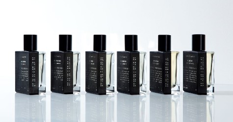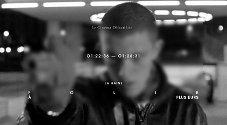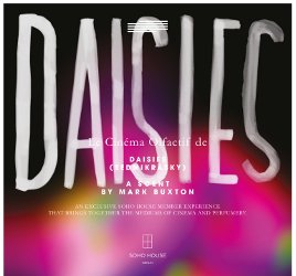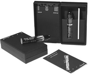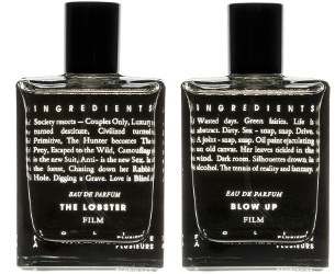
I’m tired of on-trend design. Especially if it’s bossy and difficult to navigate. Extra especially if it reads like an avant garde take on an American Apparel ad. “Get some imagination!” I want to scream. I’m so done with tiny font, nude tweens and vacant looks. Give me emotion, be honest, surprise me.
Plus, this kind of design makes me suspicious. I see a lot of sizzle, and instead of steak, I’m expecting a meat patty too small to make the cut at Barbie and Ken’s barbecue. It’s enough to drive me to comic sans and baskets of kittens.
So, to get to the point, I didn’t last ten seconds at the Folie à Plusieurs website before I jumped ship to Facebook to look for information on the brand…
