Hermès has introduced a new standard bottle for eight of the brand's classic fragrances; all are available now at the Hermès website and some are at Saks Fifth Avenue as well.
You can click on the Play Slideshow link below to see them all, or click on the arrows to scroll through the thumbnails, or click on the larger image to cycle through the whole list at your own pace.
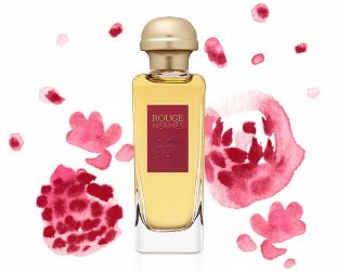
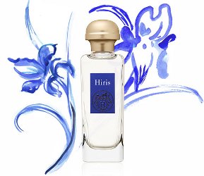
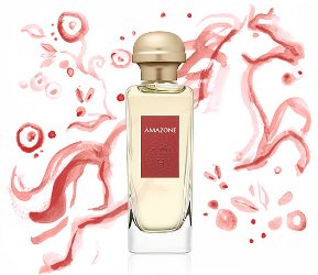
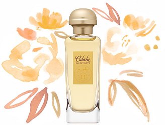
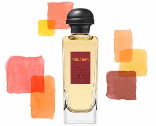
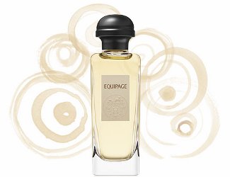
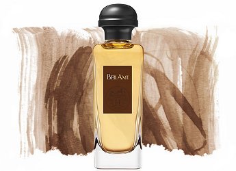
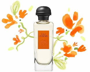
Love the new bottles Robin!
And as far as I know some of these perfumes not only changed their packaging but their formula was also remastered by Jean-Claude Ellena.
I know for sure that this applies to Hiris.
That’s what I’ve heard. I do like the new packaging, but glad they’ve left some of the old — Merveilles, 24 Faubourg. Those bottles are too lovely to lose!
I like the new bottle, but not thrilled with the cap. It looks too heavy/rounded/something for the bottle to me (maybe not elegant enough somehow?). Also fairly phallic-looking. I’m sure they don’t care what I think, anyway!
I also dislike the caps!
But I’m not the target Hermès customer, that is sure! I manage to dislike their perfumes, the scarfs… even the kelly and birkin bags!
I respect the coherence and attention to detail of the house, however, and am grateful for a luxury label that does not spark unattainable lemmings – for once!
😀
I loved the blue Hiris bottle, but don’t mind these. I don’t think the caps are any different from what they’ve been using on the cologne collection (?) and other newer scents…
https://nstperfume.com/2013/02/22/hermes-eau-de-mandarine-ambree-eau-de-narcisse-bleu/
But in general, I’m sure it’s cheaper to switch all of these older scents to a standard bottle, and since I want them to go on making them, I’m ok with it 🙂
The caps would look pretty funny if you put googly eyes on them, though. Better than a plain cylinder in that regard.
I like the bottles but the caps are not a good look, at least in the photos — especially the opaque gold caps. The caps for Narcisse Bleu and Gentiane Blanche and the like seem nicer somehow. I’m still an Hermès fan.
Agree the black caps look better than the gold. They could do really ugly lucite caps like everybody else and I’d still be an Hermès fan 😛
Yikes. I do not like the bottles. Maybe it is the presentation with the froufrou paintings behind each, but lined up next to each other in the slideshow, they look like shampoo offerings to me. I think it is the labels that don’t project luxury… not that I care a whit. I’d take several of these fragrances in coke bottles! The scents are terrific.
I always love the frou frou watercolors they do…that’s why I did a slideshow instead of just showing the bottles. But obviously not everyone likes them, so see if this is better:
http://www.parfumo.de/forum_pics/9/8/305790_419021811644a3b7cf38c30ab9f166f8.jpg
Hwy, thanks for the link. I still am variety font-adverse I think. Perhaps the likes of Chanel and others who so tightly regiment their look are having undue influence on what I associate with luxury or style… but the labels still look like shampoo bottle labels.
Hwy? What did I mean? Hmmmm… better go sniff me some Concentré de Pamplemousse Rose..
Thanks, because I was going to spend all day wondering what hwy meant 🙂