More limited edition collector fragrance bottles, with the usual disclaimers: in most of these cases, the juice is unchanged, just the bottle is “special” (or not, as the case may be), and some of these may not be available in the US.

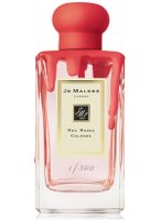
From Jo Malone, Red Roses in a special edition (300 numbered bottles were made) by style editor Charlotte Stockdale. Due at Selfridges and the Jo Malone boutique on Bleecker Street (New York) in April, in 100 ml, around $180. (via wwd)

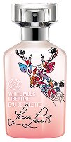
From The Body Shop's limited edition cruelty-free collection in collaboration with singer Leona Lewis, a collector bottle (or possibly a flanker) of White Musk Libertine. (via cosmoty.de)

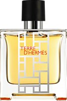
Another limited edition of Terre d’Hermès. This one is at Escentual in the UK, 75 ml Parfum for £76.

From Giorgio Armani, this year's Acqua for Life editions of Acqua di Giò for men and Acqua di Gioia for women. For each bottle sold, the company will donate 100 liters of clean water through one of their programs in Ghana , Bolivia or Haiti. (via moodiereport)
Oh wow, that Jo Malone is awful! They couldn’t come up with anything more creative? Just mess? Oh that’s one of the worst I’ve seen in a while. It looks like frosting or wax..who’s in charge of marketing? That’s just bad!
Oh, I do not hate it at all, although it doesn’t particularly tempt me either. Charlotte Stockdale has been hired by Jo Malone, so if you don’t like her taste you won’t be happy:
http://www.vogue.co.uk/beauty/2012/01/13/charlotte-stockdale-jo-malone-style-editor-beauty-regime
Ooh, I don’t like it either. Botanical etching of roses all over it would have been nice. Or roses done by a UK artist, something along those lines.
Whoa, we were thinking the same thing! *High fives*
V
They’ve done some lovely etched bottles! But I think they’ve done enough that they’d have trouble charging extra for them. Not sure why anyone would pay extra for this either, but at least it’s different 🙂
Another person who is not a fan of the Jo Malone bottle. It looks messy, and nothing about it says “roses” to me.
Don’t understand what looks like melted ice cream has got anything to do with red roses.
I assumed it was an oblique reference to the Alice in Wonderland chapter where the gardeners are painting the roses red in the Red Queen’s croquet court.
I won’t buy the bottle for it but I do like the kooky effect: it looks like some kind of rubber or silicone to me – and i think painted and etched roses have just been done to death. Also, maybe Jo Malone is trying for something a little less classical conservative than their usual fare!
Oh, good call!
OH, someone should attach your note to the bottle because that’s quite a charming idea, but I did not catch it at all, and without that explanation, the plastic blob seems pretty much to undo everything Jo Malone does well visually. I was at an event for the Sugar & Spice launch and the brand rep was talking about how they want to be the Tiffany of the fragrance world with clean iconic packaging. This seems… not that.
Ooohhhh. I bet you are correct. That helps!
Ha…looks like I’m the only one that doesn’t mind it! Although I don’t love it either.
Robin, I like the bottle. But then I saw it was for the Red Roses fragrance and now I just disapprove since there’s a real disconnect btwn the bottle and the scent. Which makes me question the judgment of this “style editor.” >:D
It does seem rather un-Jo Malone-like. I think of scents as so safe and reserved-not controversial or statement-making.
I think of *her* scents . . . that is.
Or maybe I should say “their?”
Yeah that’s my main objection also: setting aside my personal aversion to plastic crap 🙂 I really am not sure what this does to build the brand. On the one hand, the scent doesn’t match at all, and on the other, a 150% price bump on just a 300-bottle run seem an unlikely way to attract the youth market, which would otherwise be my best guess as to why they’d be making such a hard right turn away from their classy packaging. (One of the Stockdale interviews mentions her desire “to add a little more whimsy, a little more fun. As a stylist, I can see where we can be more textured and colourful, especially in relation to home and packaging.” I take that as marketing code for “sell more bottles to young women.”)
Ah well, it’s only 300 bottles in any case. Bet they’ll sell them all.
It has that “melted candle in a Chianti bottle” vibe.
It’s just there is a pretty bottle underneath all that goop on there. So far, I don’t like her taste, lol. To each their own:). Maybe etched red roses would be more my thing, idk.
It looks to me as if someone spilled paint all over that Jo Malone bottle. Apparently, he/she never heard of a dropcloth.
lol..I think it’s supposed to be artsy..but was 80’s splatter paint artsy?:)
Totally OT, but you just gave me a puff-paints-and-Keds flashback! Wow–that’s a smell/feel I haven’t thought about in a long while! Do you remember how spongy the puff paints would get when it dried? And compulsive me, I would slowly pick it all off of my canvas shoes, so it probably looked pretty awful pretty fast!
lol puff paint..it kind of curdled after the drier….yep! Turn that Jo Mo bottle into day-glo or heck, make the juice day-glo and we really got a party goin on, lol.
Might need to find my leg-warmers and hoop earrings, if we’re gonna play like that!
LOL puffy paint. I’ll make you an even better limited edition puffy paint bottle of Jo Malone, and it won’t even cost $180. Edition of 1!
How can I refuse such a bargain?! 🙂
Apparently NST is not going to fill up the waiting list for those 300 bottles 🙂
Ha no, seems not–but I’m sure you’re still right that they’ll have no problem selling those 300. Wish I could see the demo data on who buys them though–it’d be so interesting to know whether it does differ from their average client, and in what direction.
I’m crying FOUL on the Jo Malone bottle. It’s a direct rip-off of the Makers Mark bourbon bottle. They’ve dipped the top of the bottle in red wax since 1959. There are also “collectors’ bottles” dipped in other colors and for other events.
Rappleyea, the Maker’s Mark bottle was the first thing I thought of, too (was just scrolling through the comments to see if anyone had mentioned that yet). I’d rather smell like Maker’s Mark than like Red Roses, too.
lol! You know a Kentuckian – and I’m a Maker’s Mark Ambassador, although anyone can be one – would catch that. I’m kind of surprised that they so blatantly copied the MM bottle.
I agree about the scent! Nothing finer than a little “bourbon and branch”! 😉
The scent is roses…. do you think they were trying to make some connection with Kentucky and the Run for the Roses? It’s a little obscure for a perfume company though.
You guys know your stuff. Alice and Wonderland and that Maker’s Mark are good calls. I’ve never heard of Maker’s Mark but..ya I see the similarities! Reminds me of that stuff to make a seal on an envelope..that red rubber or whatever.
Oh yeah, sealing wax! So you can stamp your family crest on the back of your correspondence 😉 I think that’s basically the same stuff Makers uses.