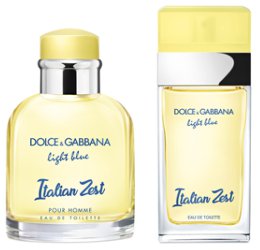
Dolce & Gabbana has launched Light Blue Italian Zest, new limited edition flankers to 2001's Light Blue and 2007′s Light Blue Pour Homme. Last year's model: Light Blue Love in Capri and Light Blue Pour Homme Beauty of Capri.
Light Blue Italian Zest ~ "Inspired by the typical Italian limonata freshness, and la scorza di limone: the Italian Zest. The Italian Zest evokes the sparkling summer days as well as the best part of lemons, giving to this iconic fruit its bright yellow color and unique fizzy and refreshing taste." Additional notes include Granny Smith apple, rose, jasmine, cedar, amber and musk. In 50 or 100 ml Eau de Toilette.
Light Blue Pour Homme Italian Zest ~ "Light Blue Pour Homme woody spicy accord is an explosion of masculine freshness, a citrus overdose top reinvented with bergamot of calabria." Additional notes include tangerine, grapefruit, pepper, juniper, rosemary, rosewood, incense and musk. In 75 or 125 ml Eau de Toilette.
(first quote via myer.com.au, second quote via shop.davidjones.com.au, additional information via manor.ch)
Hmmmm D&G is a hard pass for me.
I am not a LB fan…
Sniff worthy if/when I come across it…..Usually my little Belk store gets these at some point!
I never ran into last year’s flankers, but I didn’t look for them either.
Is it just me or does the font that says ‘Italian Zest’ make those bottles look cheap?
(And I dont think Dolce & Gabbana want to look cheap)
Agree, not a great font choice — but I think it’s the font they were using for the “light blue” wording anyway and it just wasn’t as noticeable because those words are smaller?
Hmm I think the cheap feel also comes from those colours.
I associate yellow and blue mainly with everyday ‘boring’ stuff, like Zeeman (a cheap clothing chain store here in The Netherlands), our railway operator (NS) oh and IKEA of course.
I like the fresh, new look. (The red and blue D & G caps were cheap-looking as well.) And I do like the original Light Blue.