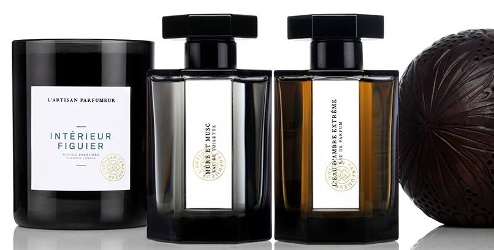
L'Artisan Parfumeur is turning 40 this year (after being acquired by Puig in 2015), and they're introducing a new look. What do we think?
Posted by Robin on 40 Comments

L'Artisan Parfumeur is turning 40 this year (after being acquired by Puig in 2015), and they're introducing a new look. What do we think?
Leave a comment, or read more about commenting at Now Smell This. Here's our privacy policy, and a handy emoticon chart.
You must be logged in to post a comment.
I quite like the new look. It’s maybe rather masculine, but it acknowledges its origins in a civil sort of way. Perhaps it’s a bit non-nonsense and state-your-business, but at least it’s not vulgarly over-decorated with pointless embellishments.
Gone to the Dark Side of the Force, they have…
I don’t think i care for it. I liked the most recent look. The illustrations were lovely. Glad they have kept the bottle shape though.
I agree with Waterdragon. They do look rather masculine. But, to me, its always what’s inside the bottle (the juice) that matters. Having an attractive bottle is just an extra plus for me.
Swooning. I love it.
Love it. Dark bottles protect the precious juice from the ravages of light.
Also, look for the ‘older’ bottles to flood the market at discounters. Win/win if you ask me!
YES YES YES!!! Hoping for some clearance goodness soon!! 🙂
Yes, and changes in packaging can be a boon for vintage hunters of the future, not just bargain hunters of today.
Yep, good thinking there
Awww! So true. You may be on to something.
New (hideous) packaging I assume also means new owners and reformulations. This looks way too masculine, black can look feminine and luxurious like the Serge Lutens makeup line but this isn’t working, it looks like old men’s shaving cream line. Horrible!
I like the dark bottles and caps better, but not sure about the labels.
Will see what NM has in a few months, maybe they aren’t as dark as they look in the picture?
I cannot decide. I like the dark colors. The labels look nice too. I’m old school…I still like the older bottles best, the ones before the last redo (and now I can’t remember when that was). And can’t even imagine La Chasse in that bottle…will have to see it.
2007? I think Dzongkha was one of the first in the new bottle. I like the bolt caps more than the last.
Yes, that sounds right…I remember Dzongkha being the first now that you said it.
And should have said — thanks!
Don’t mind the new bottles, the juice is what’s most important to me. So I like that they’ll protect from the light but the labels are less distinct. Will they also be changing the colors of the juice? Hopefully those caps are still metal, not plastic.
You’re right, Robin, I can’t imagine La Chasse in a black bottle! Seems so unsuitable, but we’ll see.
If the manufacturers haven’t done so already, they should consider putting a UV protective substance in or on lighter-colored glass to protect the contents. Maybe this is a million-dollar idea that I just gave away for nothing! D’Oh! 😉
These are quite modern with a tiny nod to the current “classical” bottle. IMO, which counts for zilch, I think they are nice and very well done. That being said, I’m very happy I have ST and T42 in the current bottle design. I absolutely love everything about the current bottles; from shape to weight to cap to label. On of the classiest bottles in perfumery.
I agree it looks masculine. It’s not really doing anything for me but it’s not totally hideous.
Nah. Don’t like them. They look like part of a line of shaving products. And the labels are so generic!
I suppose I had better hold onto my old bottles of Seville a l’Aube and Passage d’Enfer.
Not only it’s cold and masculine but it’s lost its original retro bohemian chic identity. I’m upset.
Ooooh! I LOVE the fact that the old model bottles might end up at discounter stores. (I hope!)
Ditto! We can only hope… 🙂
The possibility of an April Fool’s prank occurred to me….I was most interested in finding out if anything had been discontinued, so I went to the website. L’Eau de L’Artisan is back. Rose Privee is already gone, unless they just don’t have it in the new bottle yet. Most important of all to me, Passage d’Enfer is there!
Ah, but as I suspected, La Chasse looks just weird.
So out-of-character for La Chasse. Wrong. So wrong I’d have to spray with my eyes shut so it doesn’t change the way I perceive it. Ditto Safran Troublant.
I don’t really mind the bottles, but I do wish they had retained some distinctiveness between the labels.
After enjoying several samples and decants, I recently purchased my first full bottle from L’Artisan. (The training wheels are coming off!) I’m glad I have one of the previous bottles.
The new bottles look great to me, but whoa-nelly, that’s a wildly different aesthetic. I wonder if other fragrance houses will go down a similar path.
I hoped to see more photos of the new bottles and packaging (I love packaging), but the US L’Artisan website is down for a makeover until April 4. Boo.
Go to the French site and you can see the bottles…
Ah, bon. I should have thought of the French site.
The fragrances vary greatly in color depending on the scent. The bottles look brighter and more interesting than I expected from the photo at the top of this post. I like the packaging even better than before.
And La Boule de Provence! So beautiful.
Which one did you get?
Oh! I got La Chasse aux Papillons EdT. I couldn’t resist, it is charmingly disarming. Makes me smile every time. 😉
The proportions look different – more squat. At first glance, I don’t care for that, but I guess I’d have to see them.
I’ve never been a fan of the heavy brass “bolt” caps that replaced the previous lucite caps. I’m always afraid I’ll let one slip and break the bottle.
I’m ambivalent about the color scheme.
Wow. I like the look, but doesn’t say L’Artisan to me. Wonder what the next scent will be.
Oh. I guess it’s old news and it’s this one: Bucoliques de Provence
http://www.artisanparfumeur.fr/shop/nos-parfums/bucoliques-de-provence-eau-de-1243263.html
The addition of flowers to the label helps a bit. They need to do something like that for poor La Chasse which looks completely incongruous and out of character in its new dark bottle to me.
I like understated, I like dark glass, I really like these.
I hate it because of the label. Very cheap looking for such an expensive perfume. Mine has the cheap paper label applied crooked, with a bump in the middle and is now peeling off. I know it’s what is inside the bottle that counts, but when you spend $130 for a bottle of perfume you expect to have a nice looking bottle on your counter.