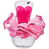
Betsey Johnson has launched Too Too Pretty, a flanker to last year's Betsey Johnson Too Too. Johnson's fashion business filed for bankruptcy earlier this year, but she will be launching a new dress line in 2013.
Too Too Pretty speaks to the girl who is radiant, charming, and confident. Vibrant fruity and floral scents infuse with soft musks and woods to create a fragrance that remains true to Betsey’s forever playful attitude.
Fresh waterlillies [sic] mixed with a hint of sparkling cassis and playful bursts of lemon blossom introduce the fragrance. Delicate floral undertones of osmanthus, pink grapefult [sic] flower, and gardenia mingle with whipped vanilla, lush blonde woods, and subtle musks, leaving an addictive lasting impression.
Betsey Johnson Too Too Pretty is available in 30, 50 and 100 ml Eau de Parfum, and can be found now at Sephora.
(via sephora)
What can I say about the bottle? Too too hideous. That said, I’m willign to try anything with a gardenia note.
I frequently like kitsch bottles, but didn’t like the Too Too bottle & don’t like this any better.
I think this may be the ugliest bottle I’ve laid eyes on. I mean, it looks really cheap, which is scary – I wonder how much cheaper it will look in person. It’s the camera adds 10 lbs syndrome for perfume bottles. They tend to look prettier in the press and ads, then cheaper in real life.
Totally agree about the 10 lbs syndrome: plastic tends to look better in pictures.
I was SO disappointed in the original Too Too bottle when I finally saw in person. I love kitschy and tacky, but it was too cheap, even for me…and that is pretty doggone cheap, I assure you. This one can only be worse, IMHO, since it’s so very bright.
I still think the idea is adorable, but I’m not sure how they could make it work. You need the tulle for the fullness, but it looks very cheap when exposed.
There are only a few brands that can pull off kitsch really well — the Harajuku Lovers series was the best so far, I think.
MY EYES!!! MY EYES!!!!!
These incessant fruity florals! Come back Oud, all is forgiven!
The bottle’s ghastly. The list of notes makes it sound exactly like something from Bath & Body Works. And it’s “addictive” (there don’t seem to be many commercial scents launched in the last few years that aren’t). There is nothing right about this scent.
It seems like Betsey Johnson needs to review her design concepts. She’s been quirky for the past 40-50 years and that’s fine, I guess, but the design of that bottle just looks tired.