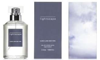
Niche line Ulrich Lang will launch Lightscape this fall. Lightscape is the brand's fourth fragrance.
LIGHTSCAPE explores the interplay between the bold freshness of galbanum and Sicilian lemon against the delicate refinement of violet leaves. The middle note in LIGHTSCAPE showcases the violet flower blended with subtle florals, sculptural woods and rich ambergis to create a contemporary scent. LIGHTSCAPE's dry notes of musk, woods and creamy tonka bean add another layer of comforting warmth that is both subtle and sensuous. LIGHTSCAPE’s unique scent is versatile enough to be worn year round and transitions seamlessly from day to night.
Staying true to their roots in the art world, LIGHTSCAPE's packaging is photographed by Amsterdam-based Elspeth Diederix, a visual artist who uses photography to register her sculptural ideas. Diederix enhances images of nature to create a new layer of conceptual beauty. Her illusory and surreal constructions appear to be derived from dream-like existences. Diederix adds another dimension to her billowy cloud image by superimposing flashes of light. Diederix’s luminous interpretation perfectly complements LIGHTSCAPE’s airy fragrance.
The notes include galbanum, lemon, violet leaves, iris, rose, violet flower, cyclamen, cedar, ambergris, tonka bean, cashmere wood, musk and ambrette.
Ulrich Lang Lightscape will be available in 100 ml Eau de Toilette.
(via press release)
This one sounds beautiful and I love the visual.
They do really nice, non-flashy packaging.
Lightscape is very very nice with soft beautiful projection and very good longevity. Fresh, clean and green with staying power at a 1/3 of the price of authentic GIT from Creed. The violet leaf and flower is intoxicating.Great daytime scent. This jumped into my top 5. Love it..
I don’t have anything by this brand, but Ihave enjoyed sniffing his work. THis one does sound nice
By the way, I know I make alot of snarky comments about illogical, distasteful and often idiotic fragrance ads. This is my idea of how they should be done, give a description of how the stuff is supposed to smell and the overall impression it is supposed to make.
Well, i could still make a snarky comment about how a photo of a cloud is not considered art, but that would be in reference to the packaging and not the fragrance. On the flipside, i really did enjoy Nightscape, but violet centric fragrances are complete hit or complete miss for me.
Perhaps there are “superimposed flashes of light” which are not fully captured by the screen image of the packages, or perhaps the photographer is just a bad artist.
I still prefer this ad copy to the blather about the “noir” side of flowers (Yes, botanists have documented that blossoms which lack cervical cortexes are nonetheless secretly plotting political corruption, adultery and other immoral thoughts), seductive pink peppers, 14 year old singers who claim to have personally developed each aspect of a scent which still somehow smells identical to what sold well last year at Target,
Agree — pretty low-key description.
I hate how everyone now is just printing ads on their packages, so tacky. For me, ad on it, won’t buy. 🙂
I’m sorry, I don’t get it — what ad?
Put a bird on it.
*That* made me laugh.
I’ve always wanted to know this but am just working up the nerve to ask: what does ‘cashmere woods’ mean?
Here you go:
https://nstperfume.com/perfume-glossary/#Cashmeran
Thank you!
Oh this glossary is heavenly! So educational and just plain fun to read. Don’t know how I missed it until now but thanks again.
Glad it helps!